Adidas Campaign Ad

http://www.melblanchard.com/adidas

Adidas is a shoe company. This company advertises the idea that with their brand of shoes you will be able to not just complete the desired race or accomplishment, but will be able to go much father.

The Original

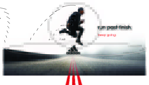
The design of this ad uses the rule of thirds in the background to help the running man stand out in the center. It also helps your eye draw to the more important elements of the ad, such as the words and logo, by having the top two-thirds of the ad whited out.

The color used in this campaign ad helps the reader focus on the words. The colored lines at the bottom of the page also helps the reader be drawn to the logo right above it.

the editor uses the same kind of typography for both sentences. The only difference is that the top one is bold, black, and bigger. The contrast in color and size helps bring the eye to it.
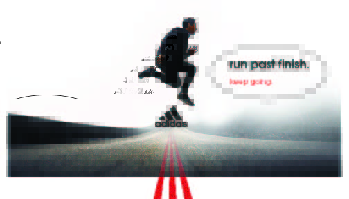
The New Ad

Unlike the original, I made the line more central so that more depth could be added to the photo. But I left my running guy in the same place as the original. This helps fit the ad campaign by leaving the men in the same places and other details in similar ways, but changes slightly with the added depth to the road. I also switched up the kind of road so that the ad would appeal to different target audience as well.

Colors are what tie the campaign ads together so I left the colors fairly the same so that the could be unity in this aspect.

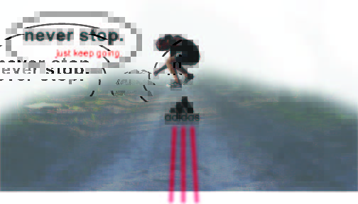
I used the same idea as the original for this ads text. The only change is a slight change in words and the words are on the other side to give variety to the campaign.
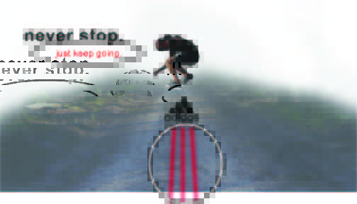
Conclusion

I believe these ads work together because of the chosen design elements that help them work together. As soon above the consistency of certain designs and the slight changes gives each reader to see know from the start who they are advertising, but then also give a little variety in depth and location.

Using Type and Photography

https://islandertagimoucia.weebly.com/blog/skateboad-magazine-layout

Depth of Field

This photo is using depth of field it allows her to stand out while also having a calm background behind her.

Type

They used several different fonts. In the word “Who Run The World” the author uses a Modern font. You can tell from the factor that there is a vertical stress, there is a thin to thick transition in the stroke of each letter, and there are thin horizontal serifs on the lowercase letters. For the word “Girls” they use Script font. This font is seen in the curves and curve like writing. For the paragraph and for the section in the bottom left they use a Sans serif font. You can tell because there are no serifs on any of the letters and because there are no thick to thin transition in the strokes for each letter.

Within these different typefaces you can see the contrasting elements. The easy seen contrasts are the size of the lettering and the color differences. You can also see the contrast in the title by seeing the top part straight and aligned while the bottom part is full of curves and slanted.

Alternative Images

I was able to mimic the original photo by using depth of field. All these photos highlight different things that girls use to show who they are and what they like to do. These activities are long boarding, Wright lifting, and cooking. Many times people see women trying to do things men do, but the best way for girls to rule the world is to do what they love to do. I loved these photos because you can’t tell my any gender who enjoyed the activity. These photos can be swamped for the original because of the fact that girls are amazing when they are doing what they love.

Conclusion

Overall, the chosen typefaces and choice in photo style help to connect the piece. The typeface of script helps add a girly tone to the spread while also holding a sophisticated tone. The depth in field helped add the needed elements to help the overall subject of the content stand out.

Wendy’s: Food for the Eyes

Wendy’s Revamps Hamburgers with Original Recipes and New Campaign

Have you ever seen an ad that makes your mouth water? Many ad’s have eye catching pictures, but what many people don’t know is that it’s not just the picture that makes this ad appealing to the eyes. Let me take you through some of the design aspects that make this add appealing to the eye.

REPETITION

As you look at this ad you will see the repetition in the the colors used. There is a consistent use of the white lettering. There is also repetition with in the spacing and size of the word blocks.

CONTRAST

There are contrasts in the style of fonts given. Within each of the text boxes on the sides there are several different fonts that are distinct, but compliment each other.

ALIGNMENT

There are many lines on this ad. There are boxes on the side that make hard lines and edges for this ad. These lines also make the ad symmetrical.

PROXIMITY

Within this ad there is not tons of white space, but the white space there is pleasing to the eye. Also there are a few different ideas on this ad and they are all placed together properly. It also lets the main parts stand out in while allowing those of less importance be seen.

COLOR

The color found on this add help let the picture of the hamburger pop. The white also stands out against the red as well. There are not a lot of colors used, but as they work together they allow the reader to view the ad in a pleasing matter.

In conclusion you can see how much effort was put into this ad. The style and colors used allow the reader to not feel overwhelmed when looking at this ad, and at the same time receive the information that the company want them to know.

Design a site like this with WordPress.com
Get started