Wendy’s Revamps Hamburgers with Original Recipes and New Campaign
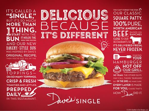
Have you ever seen an ad that makes your mouth water? Many ad’s have eye catching pictures, but what many people don’t know is that it’s not just the picture that makes this ad appealing to the eyes. Let me take you through some of the design aspects that make this add appealing to the eye.
REPETITION
As you look at this ad you will see the repetition in the the colors used. There is a consistent use of the white lettering. There is also repetition with in the spacing and size of the word blocks.
CONTRAST
There are contrasts in the style of fonts given. Within each of the text boxes on the sides there are several different fonts that are distinct, but compliment each other.

ALIGNMENT
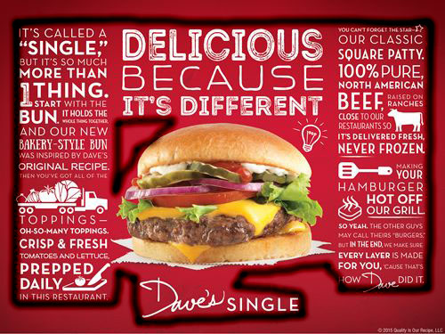
There are many lines on this ad. There are boxes on the side that make hard lines and edges for this ad. These lines also make the ad symmetrical.
PROXIMITY
Within this ad there is not tons of white space, but the white space there is pleasing to the eye. Also there are a few different ideas on this ad and they are all placed together properly. It also lets the main parts stand out in while allowing those of less importance be seen.
COLOR
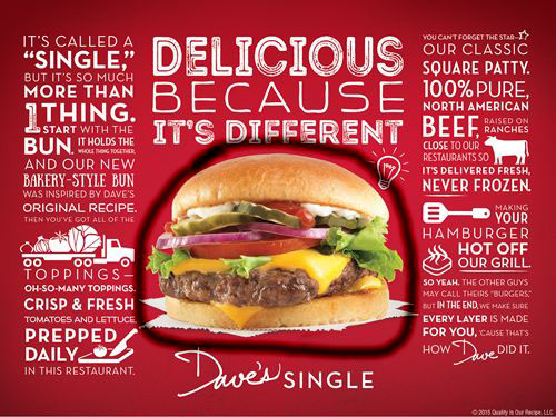
The color found on this add help let the picture of the hamburger pop. The white also stands out against the red as well. There are not a lot of colors used, but as they work together they allow the reader to view the ad in a pleasing matter.
In conclusion you can see how much effort was put into this ad. The style and colors used allow the reader to not feel overwhelmed when looking at this ad, and at the same time receive the information that the company want them to know.

