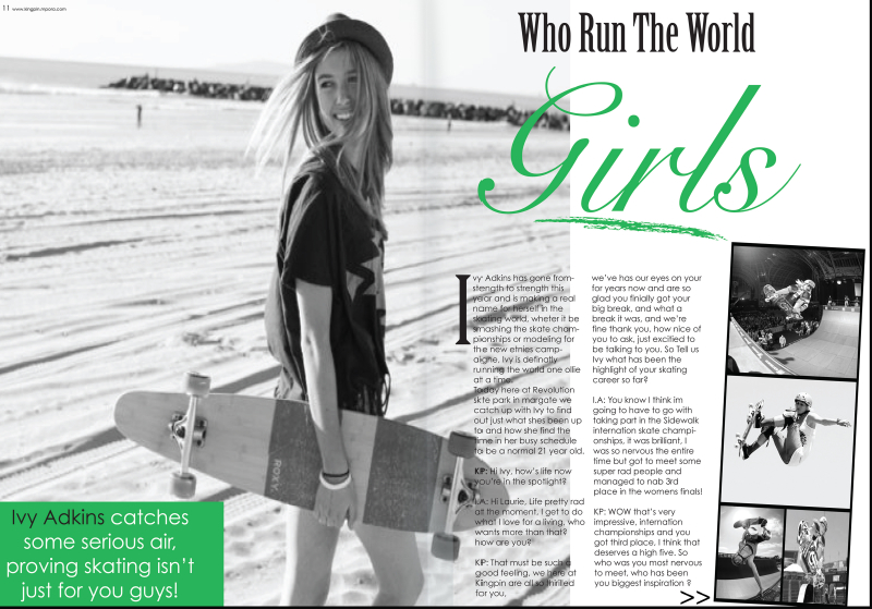
Depth of Field
This photo is using depth of field it allows her to stand out while also having a calm background behind her.
Type
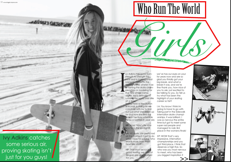
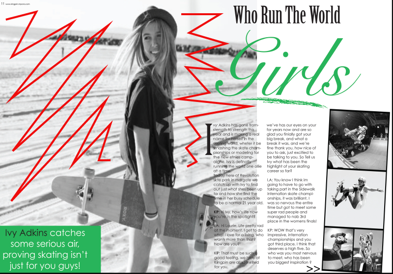
They used several different fonts. In the word “Who Run The World” the author uses a Modern font. You can tell from the factor that there is a vertical stress, there is a thin to thick transition in the stroke of each letter, and there are thin horizontal serifs on the lowercase letters. For the word “Girls” they use Script font. This font is seen in the curves and curve like writing. For the paragraph and for the section in the bottom left they use a Sans serif font. You can tell because there are no serifs on any of the letters and because there are no thick to thin transition in the strokes for each letter.
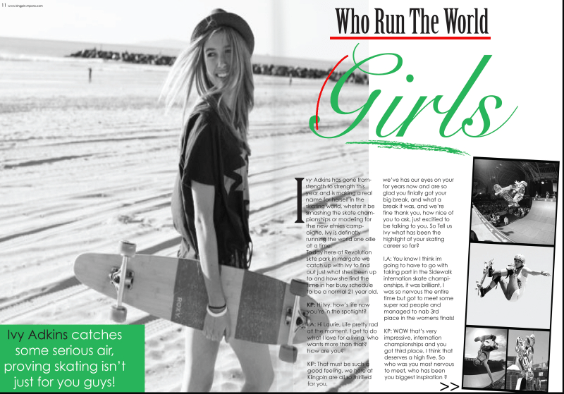
Within these different typefaces you can see the contrasting elements. The easy seen contrasts are the size of the lettering and the color differences. You can also see the contrast in the title by seeing the top part straight and aligned while the bottom part is full of curves and slanted.
Alternative Images
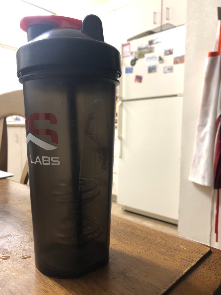
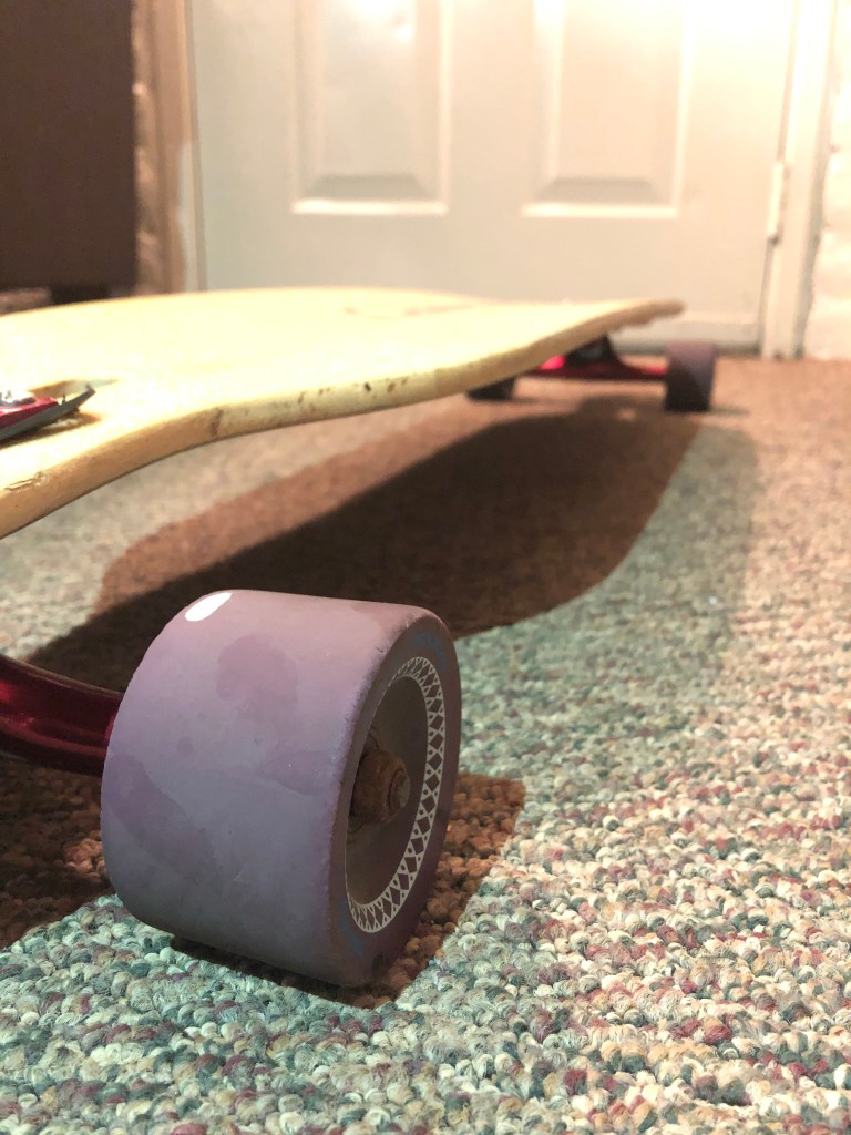
I was able to mimic the original photo by using depth of field. All these photos highlight different things that girls use to show who they are and what they like to do. These activities are long boarding, Wright lifting, and cooking. Many times people see women trying to do things men do, but the best way for girls to rule the world is to do what they love to do. I loved these photos because you can’t tell my any gender who enjoyed the activity. These photos can be swamped for the original because of the fact that girls are amazing when they are doing what they love.

Conclusion
Overall, the chosen typefaces and choice in photo style help to connect the piece. The typeface of script helps add a girly tone to the spread while also holding a sophisticated tone. The depth in field helped add the needed elements to help the overall subject of the content stand out.

